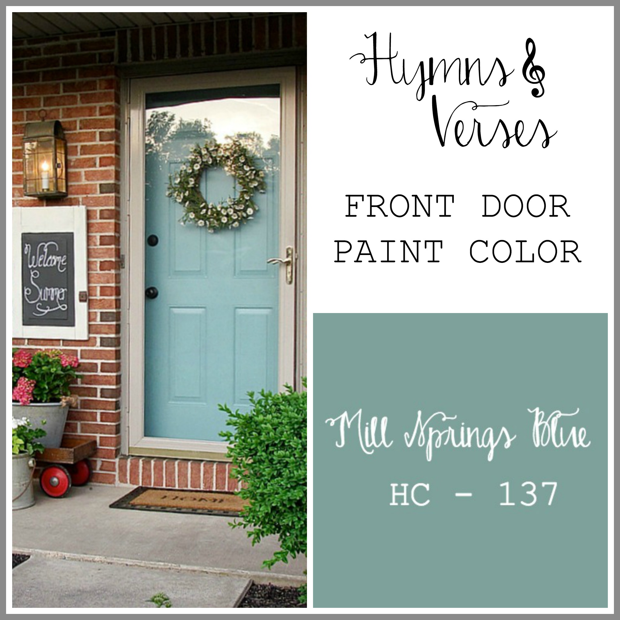
This post is a long time coming! I get some many requests about the paint colors in my home. So, here they are. We’ll start at the front door – the MOST requested! I love the color of my front door – Benjamin Moore Mill Springs Blue. As you can see – the chip color looks a little different. That could be due to lighting. It isn’t because my paint has faded, because this picture was taken right after the door was painted. I do think that sometimes a color chip (especially one online) has variations to the actual color. This color is definitely more blue than green. It is just the shade I wanted and believe me – I tried a LOT of samples before choosing this one! I painted it in 2012 and still love it! Here’s just how much I love it – over time I’ve used it to paint my porch screen door, paint the back door to my garage, paint my potting bench, paint the window boxes on my shed, and used it to paint accent furniture on my screen porch. Yes, I love Mill Springs Blue!
Now, inside you’ll see that I’m not much of a color girl! I like to keep my interior wall colors simple and add color through accents – furniture, pillows, drapes, plants and flowers, etc. That way, I’m not tied to any one color for long, because I change my mind often!!! So, here are my living room paint colors.
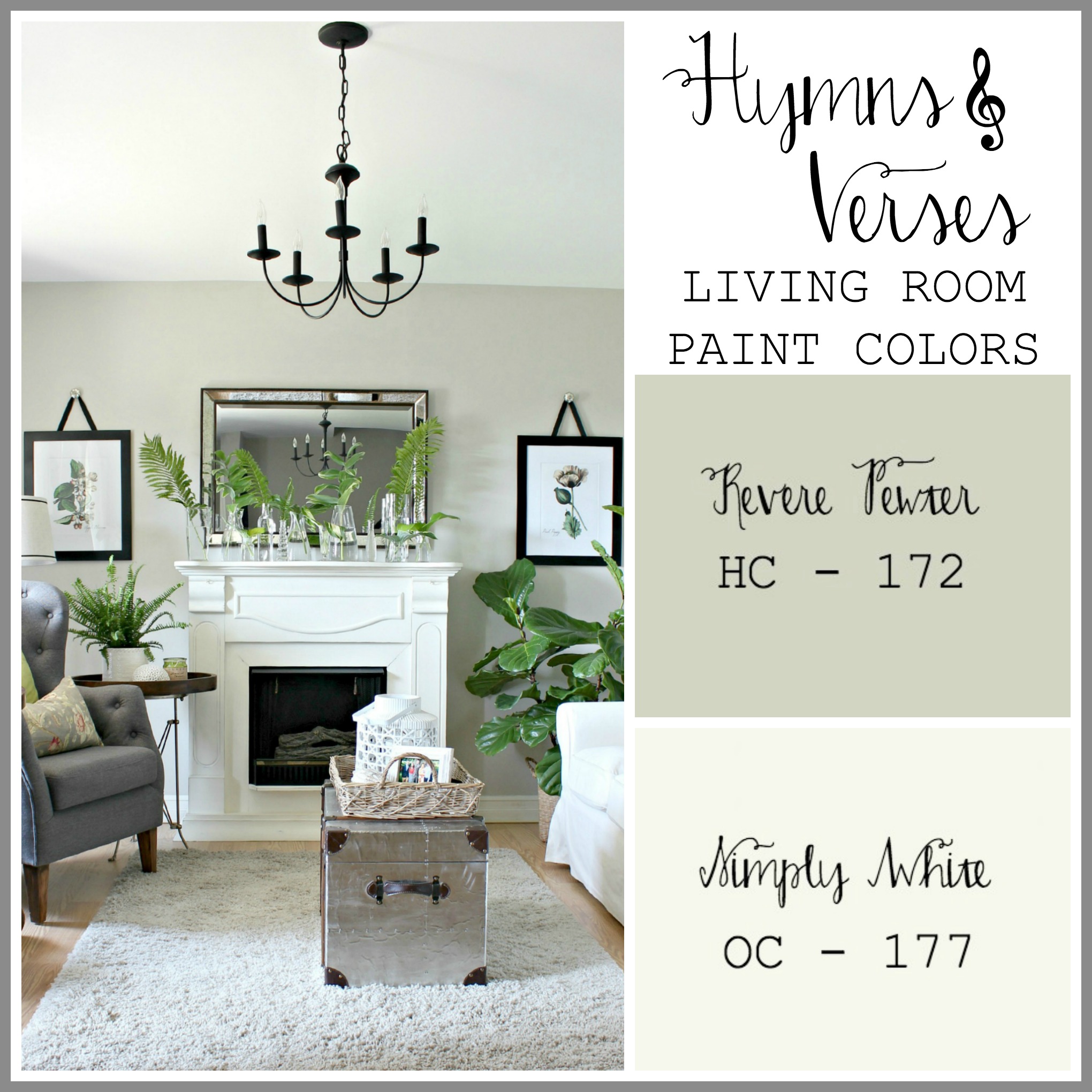
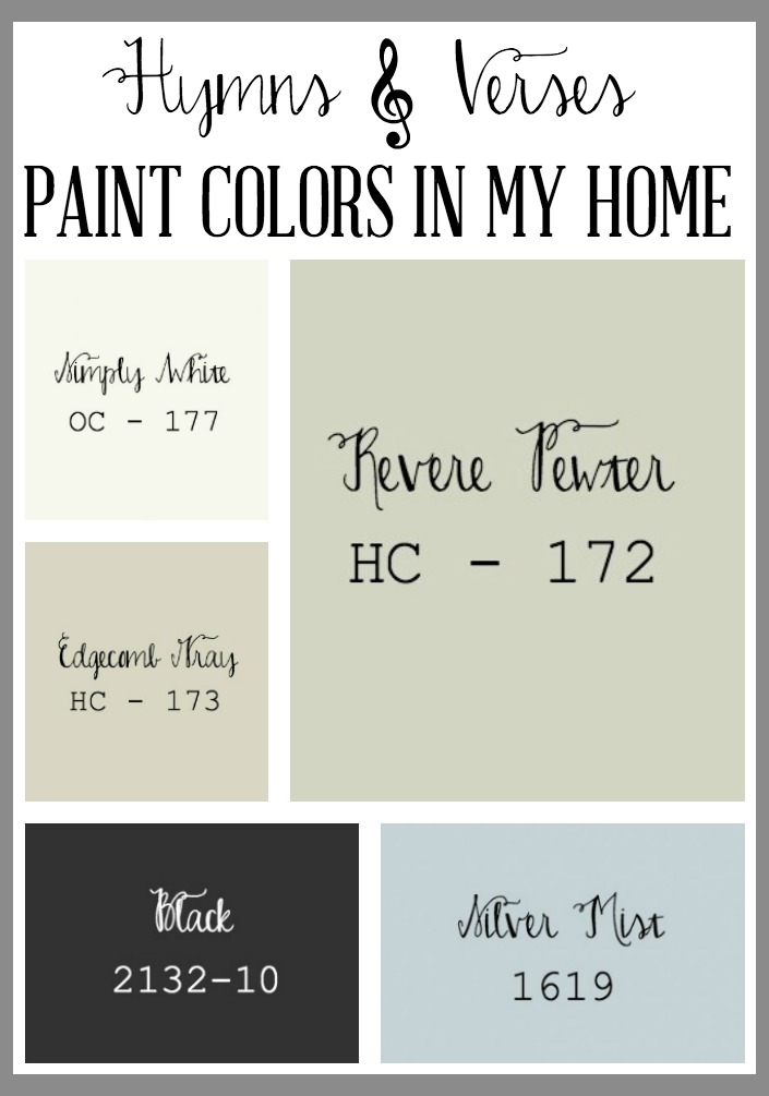
My wall color is Benjamin Moore Revere Pewter. It is what you would call “greige” – a gray/beige color that can looks more gray or more beige based on the lighting in your room. In my home, Revere Pewter definitely looks more gray (and that’s just how I like it). But, if you are going to try Revere Pewter, you really need to get a sample and try it in the room you want to use it and see how it looks at different times of day. My living room walls and walls leading upstairs and the hallway upstairs are all Revere Pewter. All my trim is painted in Benjamin Moore Simply White – baseboards, window trim, and interior doors. It’s a creamy white, but again, I think it looks more white than the sample color above. I also painted my planked wall in Simply White. One thing I’m going to change, hopefully soon, will be to paint my interior doors in a black or dark charcoal color. I’ve wanted to make that change for a while, but I have a LOT of doors to paint and I know it’s going to be a work in progress for quite a while. Stay tuned for more about that process!
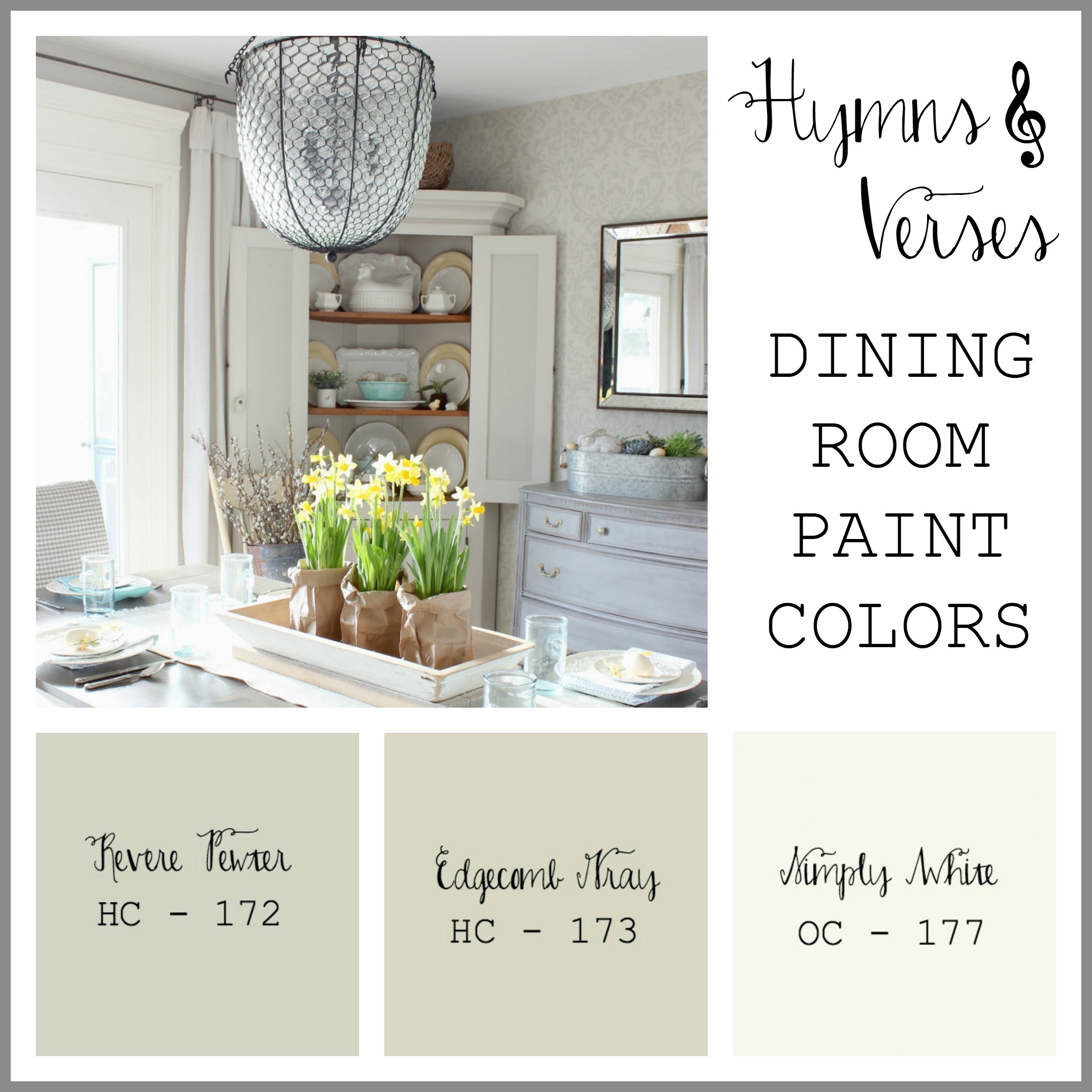
So, you are seeing a trend! Simply White on the trim. The feature wall is stenciled with the Anna Damask Stencil from Cutting Edge Stencils. The base color is Benjamin Moore Edgecomb Gray and the damask stencil design is Revere Pewter. The rest of the dining room walls are Revere Pewter.
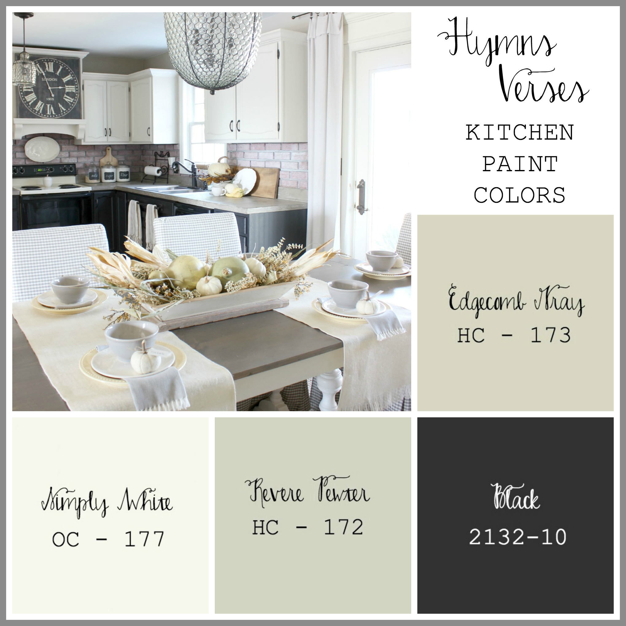
Since my kitchen and dining room connect, the walls are Revere Pewter. My lower cabinets were painted in Benjamin Moore Advance paint, satin finish, Black. This paint is really great for cabinets. The upper cabinets were painted with the same Advance paint in the color Edgecomb Gray – no the upper cabinets aren’t white. In my home, Edgecomb gray is definitely lighter than the swatch above. Right now I have a chalkboard feature wall in my kitchen that is Benjamin Moore Kendall Charcoal, but I’m about to repaint it back to Revere Pewter. I think the chalkboard feature wall just makes my kitchen appear darker – good idea, just didn’t work for me!
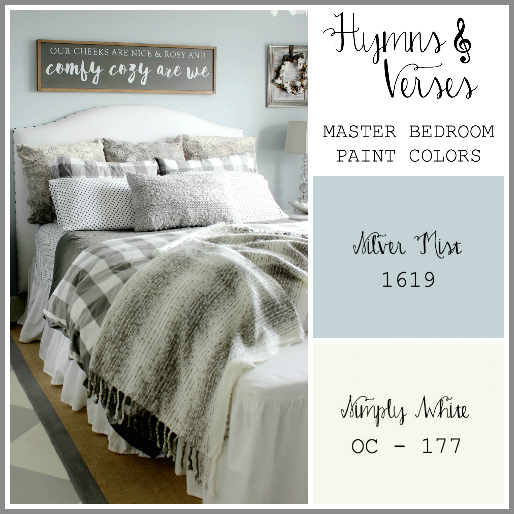
Okay – finally some color! My master bedroom walls are Benjamin Moore Silver Mist. I know it’s called silver, but as you can see, it’s a silvery blue. It was hard for me to put color on my bedroom walls, but it’s a very tranquil shade. It is light enough that it almost works the same as a neutral. My trim is still Simply White. Even the white in my painted floor is Simply White. I can’t say for certain what the gray shade is on my floors, but the floors are getting updated soon.
I hope that this post helps to see the color samples and then what the paint looks like in my home. I know I searched these shades on Pinterest a lot before even going to the store to pick up a sample. I would advise to always get a sample, paint a large enough section on your wall to get a good feel for how it will look, and then live with it for a few days. Don’t make a hasty decision – you don’t want to repaint!!! When it comes to interior wall paint finish, I always choose eggshell or matte. My trim is semigloss and is an oil based paint – more on that to come.
Thanks for stopping by today. Please feel free to ask any questions you may have!
Homepage
Friday 11th of March 2022
... [Trackback]
[...] Read More here: hymnsandverses.com/paint-colors-home/ [...]
How to Brighten a Room - Hymns and Verses
Friday 28th of June 2019
[…] a space helps you as you decorate your own home! You might also like these posts: Paint Colors in My Home Home Office Reveal Good Day Sunshine Summer Bedroom […]
Kate
Wednesday 18th of January 2017
We just bought a home this past June and have all natural wood trim (house was built in 1916 and I can't bear the idea of painting over it). Would you say these colors would go well with natural wood trim?? If not do you have any recommendations? Our dining room is painted "Sea Salt". Also we LOVE our blues, greens and grays.
Doreen Cagno
Thursday 26th of January 2017
Yes, I do thing the colors would work well with natural wood trim. I love the Sea Salt shade.
Bev
Sunday 17th of April 2016
Doreen, I love the idea of painting your doors darker. We are painting our inside doors a dark chocolate, almost the color of oil rubbed bronze, but with an acrylic, egg shell finish. It is such a rich, beautiful color. I sometimes feel as if my husband and I are the only people on the planet who don't love gray paint! In our former house, the previous owner had painted every room gray, and even the kitchen counters and back splashes were some type of gray stone. It gave the house a cold, uninviting feeling. Now, our house in the mountains has warmer, neutral colors that are comfortable and inviting. They provide a nice contrast to our mountain/lodge furnishings and go well with all the wood. God created us all different, didn't He? That's what makes His creation so beautiful. Blessings, Bev
Doreen Cagno
Sunday 17th of April 2016
I totally agree with you! And, if I had a home in the mountains, I would definitely want the same color theme that you are creating! Sounds absolutely wonderful! It's all about enjoying the home we have! Have a blessed day, Bev!
Tricia
Tuesday 5th of April 2016
Love simple colors. We bought a new home last fall with a large and open room. I left the wall colors alone as I think they are soft and neutral like yours. When painting our last home to sell I thought of using "silver mist" but decided to use white in most of the rooms in order to make the small spaces look larger. It worked because the house sold in 69 days. I still like "silver mist" and may eventually use it in our bedroom when it is time to re-paint.
Doreen Cagno
Wednesday 6th of April 2016
Me too! Easy to change up accessories!!! Congrats on the new home - have fun making it yours!!!